Aquent Gymnasium | Course Outline
Assignment: Remote Control (4-minute sketch exercise)
This assignment is a light introduction to designing with users in mind. I did a short sketching exercise, using pencil (or pen) and paper.
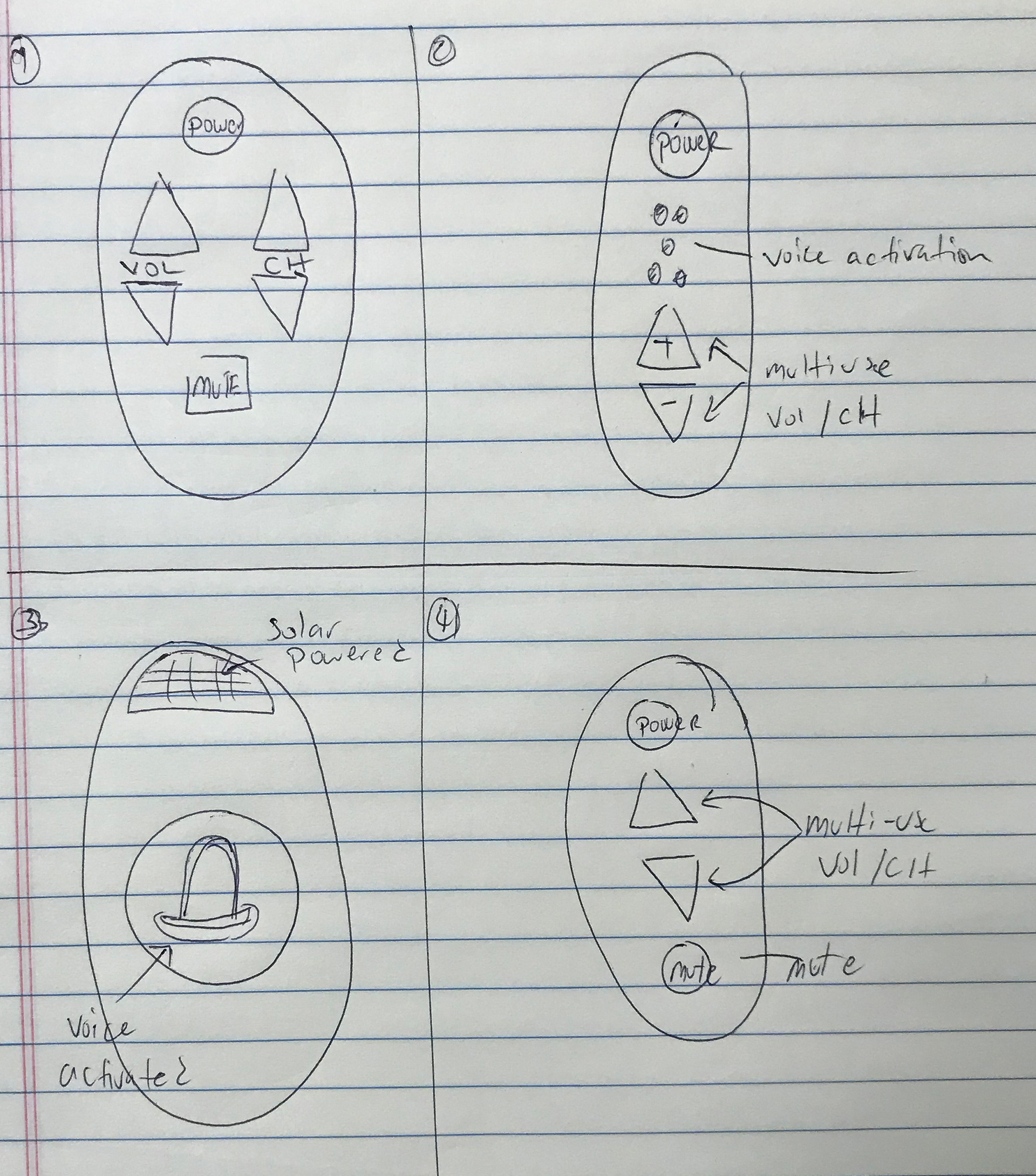
I took a sheet of paper and drew lines to divide it into quadrants (four equal-sized boxes). I had four minutes to sketch up to four ideas in those boxes. This sketch exercise is for a product, not for a website; that’s okay, and we’ll apply the same principles to websites in future lessons.
The 4-minute sketch exercise is to design a better television remote control. It’s most important to get the ideas down on paper rather than render them perfectly (or even well).
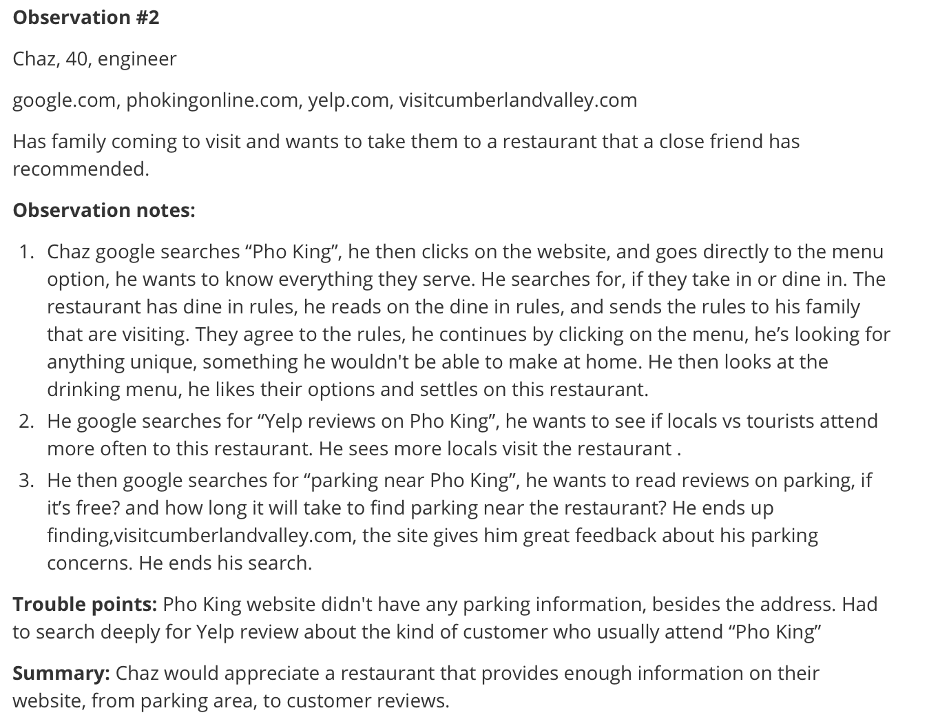
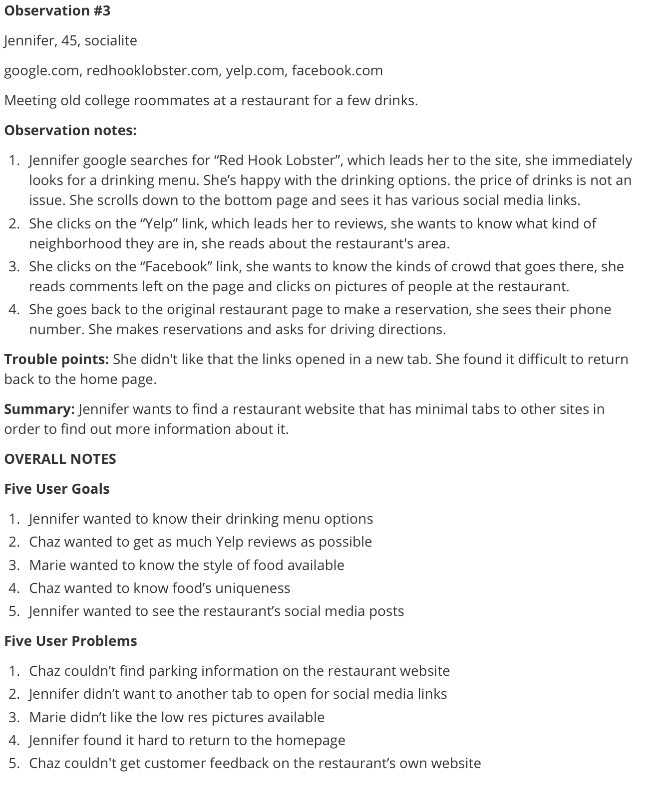
Assignment: User Research Observation
1. Find my user and their goals. One way to do this is use a technique of filling in the blanks: “The user is a _____ who wants to ____”.
2. There are tactical design benefits to liking our customers. Having empathy for users means trying to understand why they might not be getting some aspect of your product instead of blaming or ignoring them. Truly understanding their difficulties and solving them isn’t always easy under the pressures of production, but it is almost always worth it.
3. Talk to real people. Gathering data about my product or service through interviews will serve as a “reality check” by uncovering the true wants and needs of users, not just my assumptions about them.
4. Put it down on paper. Personas, scenarios, and user flows are three deliverables which can help tell me who my customers are, what they want, and how they’re going to get it from my product.
Tools used: Google Docs
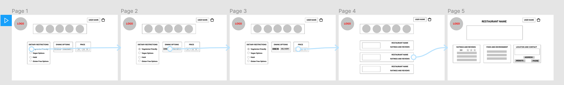
Assignment: Wire Frames: Find A Restaurant and Making A Reservation (Website)
1. Wireframes act as sketches for web pages, or for screens in a mobile app.
2. Wireframes are tricky to use, even by seasoned web designers. Clients have a hard time with them. Designers have a hard time with them. We’re going to talk about that, and how to make them easier for you and for your clients.
3. Prototypes are clickable wireframes. And they let you test ideas.
4. Wireframes and prototypes work best when you’re working quick and you’re working cheaply.
Tools used: Google Slides
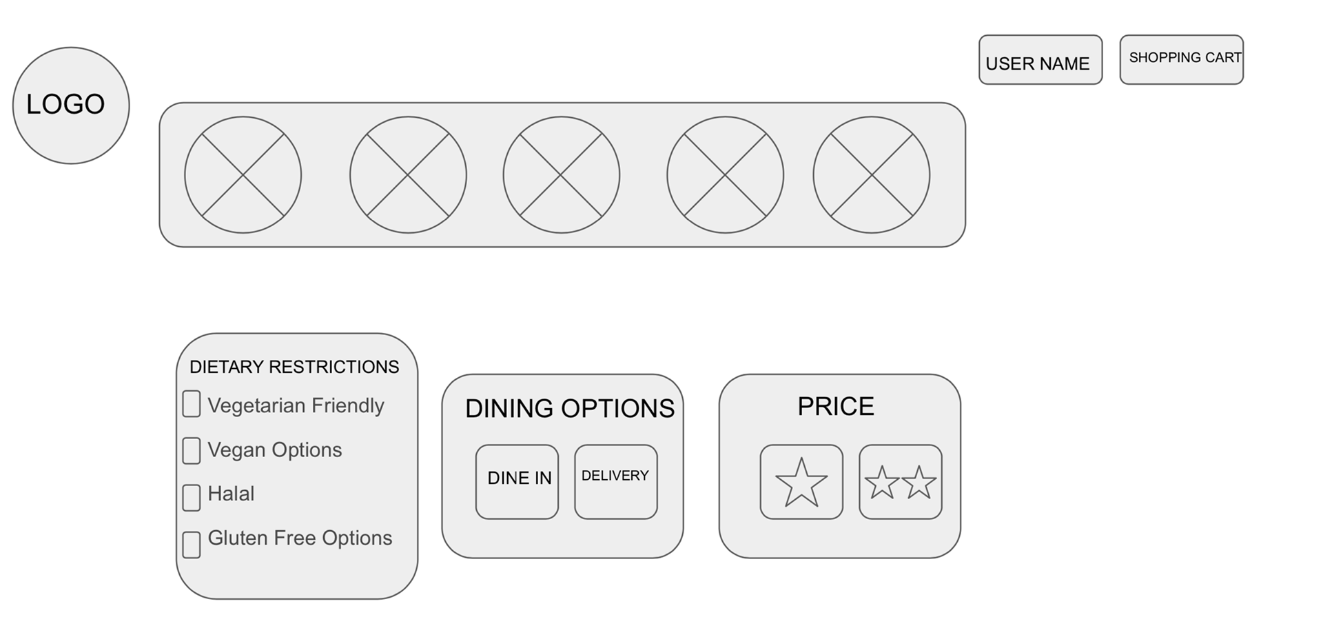
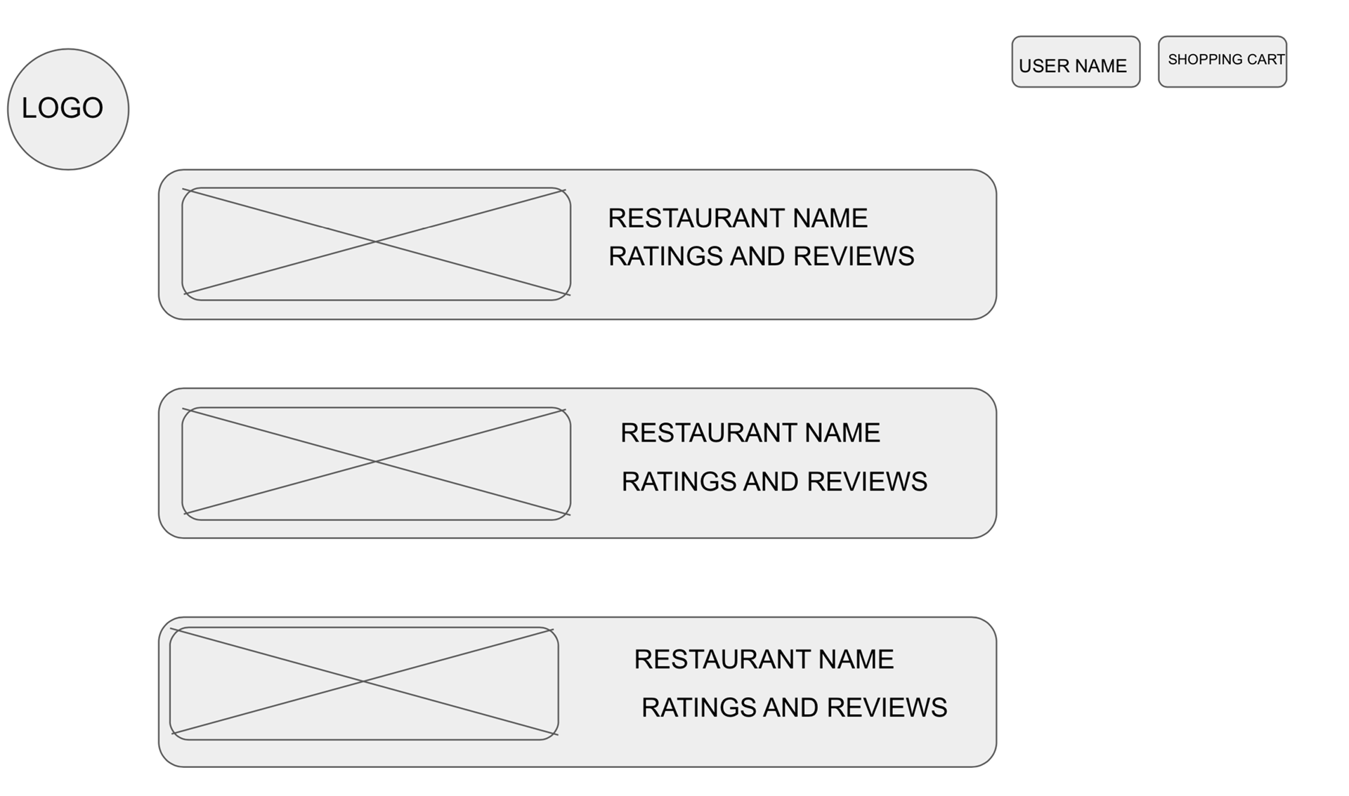
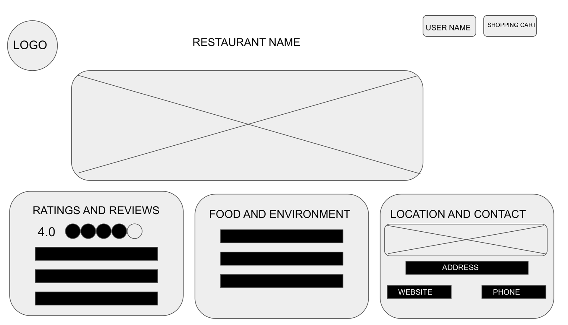
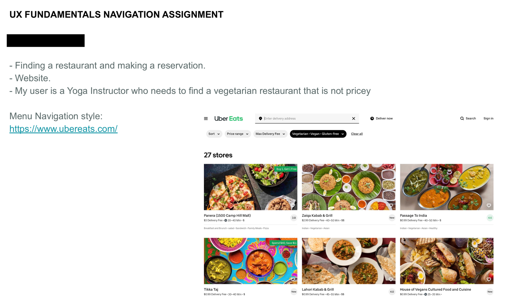
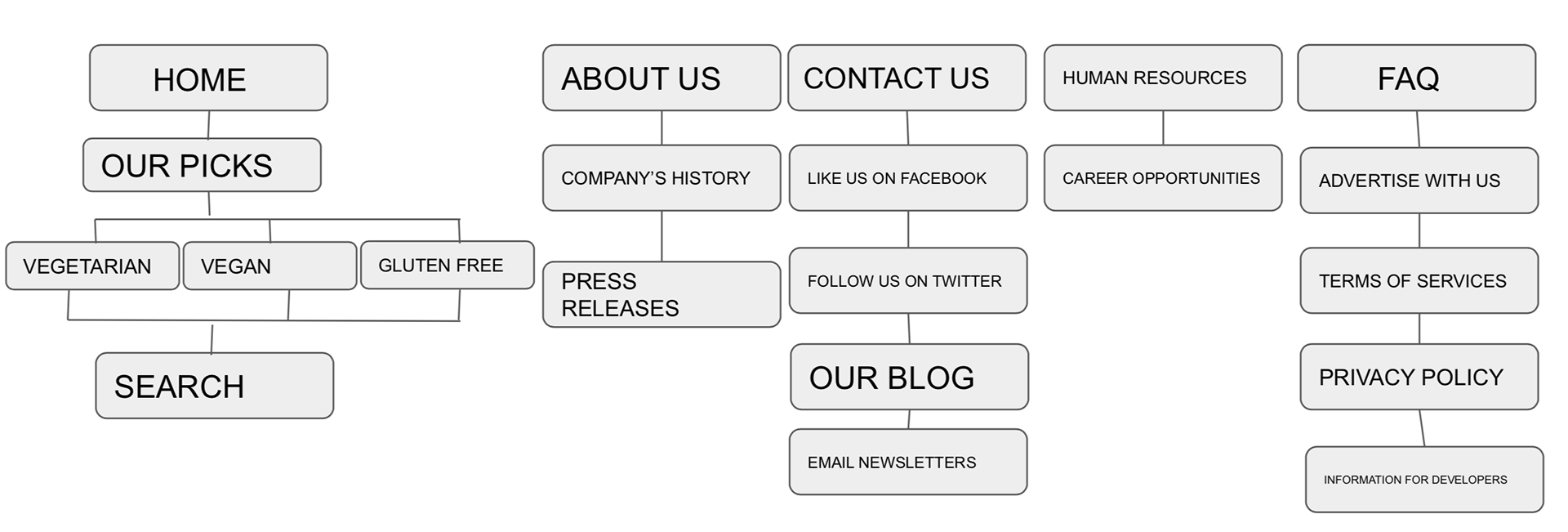
Assignment: Navigation Menu: Find A Restaurant and Making A Reservation (Website)
1. There are lots of different ways to organize a client’s website. UX designers help decide how your client’s website is organized and which structure is most appropriate for the users. This practice of organizing the content on your website is called information architecture.
2. The way to best organize your client’s website, is to let your users tell you how. Any or all combinations of personas, in-person interviews and card sorting can be used to accomplish this.
3. You have about 10 seconds or less to make an impression with a new customer. Users on the web are typically “on the hunt” for relevant information, they typically don’t read text, they scan it. Avoid unnecessary text and make wise use of headlines, bullets and hyperlinks to avoid making a visitor have to think!
4. Writing clearly instills trust in your customers and trust is good for business. Making content a priority rather than leaving it until the end is a mistake. Many organizations are beginning to use content strategists to help them prioritize content, a user experience designer and a content strategist working together equals a very strong team!
Tools used: Google Slides
Assignment: Prototype: Find A Restaurant and Making A Reservation (Website)
1. Design patterns are another name for helpful conventions. In design, conventions stem out of principles such affordance and signifiers. Affordance in web design is the quality of an object that indicates that it can be interacted with, e.g. buttons that look “clickable.” Signifiers in web design are the individual properties that carry meaning for users, e.g. the color blue or the underline used to indicate a default hyperlink.
2. The right pattern for you to use depends on the situation. Pattern libraries are collections of modular elements that organize items for use in projects, e.g. navigation bars and icons.
3. Design patterns can be used for evil as well as good. Anti-patterns are systems that unintentionally create problems for users. Dark patterns are systems that intentionally confuse, mislead or direct users in a way that benefits the owners of the website or app.
4. If you decide on breaking from best practices or tradition, only do it if your solution is a lot better. Ideally you measure this improvement in an objective way.
Tools used: Figma
Assignment: Prototype Usability Test
1. Use analytics to see what your users do.
2. Set goals, and then watch for problems. It’s not enough to just look at stats. We need to set goals for what we want to see, and then watch our stats to see what might go wrong.
3. Hold usability tests-- those are the one on one tests-- to see what our users think.
4. Understand the cycle of user experience design. Namely, first you design and then you watch users and see what they do with your design. Then, you repeat the process.
Tools used: Google Docs